Overview & Philosophy
02viz turns the QGIS environment into a full data-visualisation studio. Charting in GIS has historically meant exporting an attribute table to a spreadsheet or wrestling with a single fixed plotting library; 02viz removes that friction by putting one dock — three tabs — Charts, Map Diagrams, and Labels — directly onto the canvas, all sharing a single layer selector. The result is a visual that is not a screenshot, but a live artefact that remains bound to the layer it describes.
Three engines are vendored into the plugin and run with no network, no account, and no external Python dependency; a fourth — matplotlib / seaborn — is optional and auto-detected. All statistics and data shaping are pure Python, so the studio works identically offline on QGIS 3.28 through the QGIS 4 line (Qt5 and Qt6).
Design principle. 02viz separates data shaping from rendering. One typed spec — field bindings, aggregation, bins, palettes, overlays — is assembled in core/ and then reinterpreted by whichever engine the user picks. Every engine exposes only build_html(spec) → str and never touches Qt, which is why the same chart reads identically in ECharts, Plotly, Vega-Lite, and matplotlib, and why the studio is batch-exportable and testable in pure Python.
Quick Start
STEP 1
Open the dock
02viz Studio toolbar button
→
STEP 2
Bind a layer
vector layer or external CSV/XLSX/ODS/GPKG
→
STEP 3
Choose engine + type
or press 💡 Suggest
→
STEP 4
Render chart
interactive, click-to-select
→
STEP 5
Export / style
one-file HTML, PNG, diagrams, labels
New to it all? Press ❔ Guide for a self-contained, illustrated walkthrough of every feature, or press ✨ Explore to have 02viz profile the whole layer into a dashboard in one click.
How the Studio Works
02viz follows Wilkinson's (2005) Grammar of Graphics: a statistical graphic is decomposed into independent components — data, aesthetic mappings, geometric objects, scales, and transformations. The spec-assembly layer (core/transform.py, core/stats.py) produces a typed data dictionary; each engine re-expresses that one structure through its own primitives. This separation is the single most important architectural idea in the plugin — change the engine, and the data story does not change.
The selection bridge (chart clicks → map selection, and map selection → dimmed chart) works through the browser page document.title rather than a JavaScript window object, because addToJavaScriptWindowObject crashes inside WebCore on Qt 5.15's QtWebKit fork and QWebChannel exists only on WebEngine. Title transport is the one mechanism safe and identical on every QGIS web stack; in a plain browser it is a harmless title blip.
The default engine and the most compatible: ECharts (Li et al., 2018) is a declarative framework that renders all 17 chart types with full ES5 compatibility, so it is the only engine guaranteed to work on QGIS builds using Qt 5.15's QtWebKit fork. It drives the Explore dashboard and the animation timeline.
Capabilities
| Dimension | Detail |
|---|
| Chart types | All 17 |
| Animation | timeline component — autoPlay, loop, stable axes |
| Reference overlays | markLine / markArea |
| Special rendering | custom renderItem for violin polygons and error whiskers |
| WebKit / ES5 | Yes — safe on QtWebKit fork |
Why default. Plotly.js and Vega-Lite ship ES6+ bundles that QtWebKit cannot parse, leaving a blank panel. ECharts's ES5 build is the only fully-offline option that renders identically on both the modern WebEngine and the legacy WebKit fork — so 02viz defaults to it unless you specifically choose another engine.
Plotly.js renders all 17 chart types and provides the richest animation controls — a frames-plus-slider model with explicit play/pause updatemenus, ideal for Gapminder-style bubble races and exploratory temporal playback. Because its bundle is ES6+, it requires WebEngine (or the external browser fallback), not WebKit.
Capabilities
| Dimension | Detail |
|---|
| Chart types | All 17 |
| Animation | frames + slider + play/pause updatemenus |
| Reference overlays | layout.shapes (lines / rects) + layout.annotations |
| Cross-filter | Plotly.restyle() with per-trace selected/unselected opacity |
| WebKit / ES5 | No — shows a styled explainer page instead of a blank panel |
Fallback behaviour. On WebKit-only builds, 02viz does not fail silently: it renders an explainer page telling the user why the panel is blank and offering three options — switch to ECharts, export to HTML, or open in the system browser.
Vega-Lite (Satyanarayan et al., 2017) is the direct declarative realisation of the Grammar of Graphics: a JSON specification language compiled to Vega at runtime via vegaLite.compile(). It supports 14 of 17 chart types — treemap, sunburst, and radar are excluded because hierarchical and radial layouts are outside the Vega-Lite grammar. Users may edit the generated JSON directly, with validation before rendering.
Capabilities
| Dimension | Detail |
|---|
| Chart types | 14 — no treemap, sunburst, or radar |
| Animation | None |
| Data injection | feature rows with IDs injected as named dataset o2viz |
| Spec editing | custom JSON editor with validation |
| Violin workaround | ranged-area mark, re-paired polygon half-points (avoids order channel collapse) |
The only engine with optional Python dependencies. It imports matplotlib and seaborn lazily, uses matplotlib.use("Agg") for headless rendering, applies seaborn.set_theme(style="whitegrid") when available, and produces a static 8.2″ × 5.0″ figure at 150 DPI, base64-encoded as PNG. It is the engine of choice when the goal is a fixed, print-ready figure rather than an interactive one.
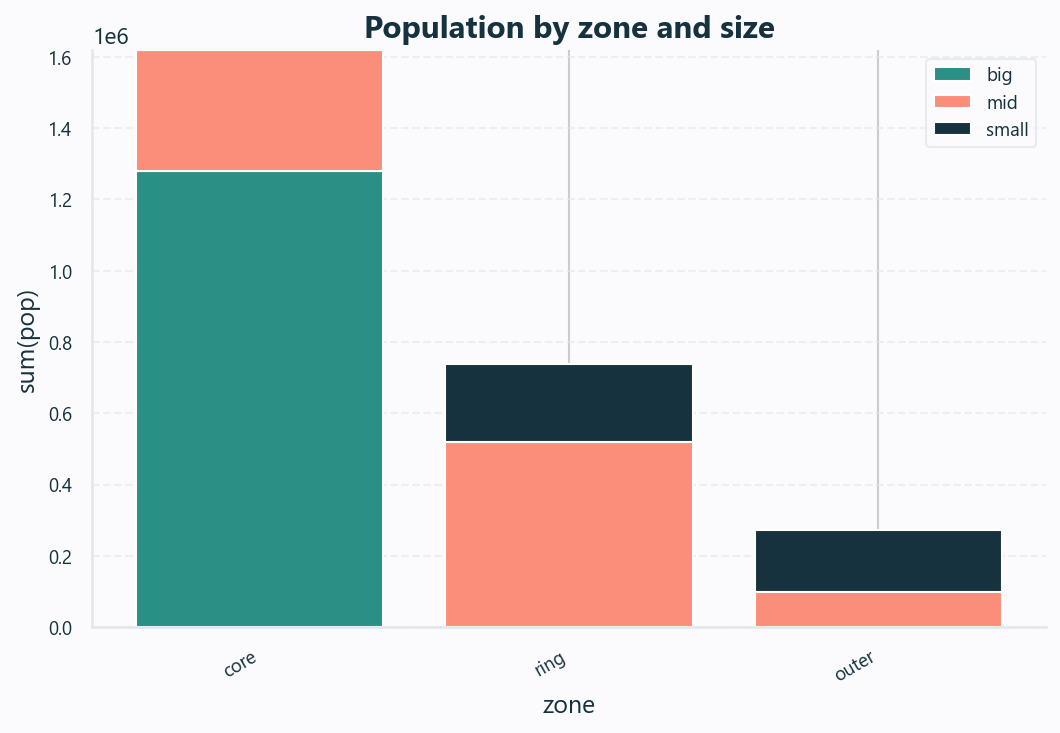
The same spec rendered by the optional matplotlib / seaborn engine as a publication-grade static figure.
Capabilities
| Dimension | Detail |
|---|
| Chart types | 11 — bar, line, area, scatter, bubble, histogram, pie, box, heatmap, density, violin |
| Output | 8.2″ × 5.0″ @ 150 DPI, base64 PNG |
| Interaction | None (static); bridge calls stubbed inert |
| Dependency | Auto-detected at startup via core/requirements.py — never pip-installed for you |
Graceful absence. When matplotlib is missing, 02viz shows the exact install command for you to run yourself; the core studio remains dependency-free and fully functional with the three vendored JS engines.
Every chart type is documented as a self-contained card: a rendered screenshot, a real-data example (real İzmir / Türkiye figures with the source cited), when to use it, what data it needs, how to read it, and how to interpret it and where it applies — followed by the exact field bindings and engine support.
The workhorse of quantitative comparison. A bar chart encodes a numeric value as position along a common scale — the single most accurately-perceived visual channel in Cleveland & McGill's (1984) ranking of graphical perception.
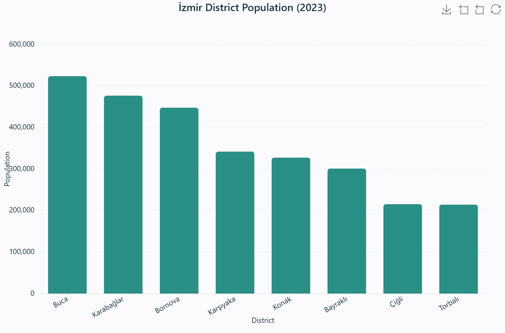
İzmir district population (2023) — one bar per district, height encodes population on a common axis.
Real data. Buca 523,487 · Karabağlar 476,500 · Bornova 447,553 · Karşıyaka 341,857 · Konak 327,300 · Bayraklı 300,949 · Çiğli 215,172 · Torbalı 214,059.
Source: TÜİK ADNKS 2023.
When to use
Whenever the question is "which category is larger, and by how much": comparing one numeric measure across districts, land-use classes, or periods. Prefer it over a pie chart once categories exceed a handful. Use grouped bars (Group field) to add a second categorical dimension, and stacked bars (checkbox) to show additive composition.
What data you need
A categorical field for X and a numeric field for Y — or just the category plus a count aggregation. A Group field optionally splits into coloured series; an aggregation (sum / mean / …) is applied per category.
How to read it
Compare the tops of the bars on the shared axis — the distance between two bar tops is the difference in value. In grouped bars, compare within a cluster and across clusters; in stacked bars, the total is the top edge and each segment is a part.
Interpretation & applications
Spot the largest and smallest category, dominance, or balance. In planning: population by district, budget by department, area by land-use class. Always check the axis origin — a non-zero baseline exaggerates differences, so read the values, not just the visual gap.
Field bindings & controls
| Binding | Role | Notes |
|---|
| X | Category field | Categorical (or numeric binned) |
| Y | Value field | Numeric; aggregated with the chosen aggregate |
| Group | Series field | Splits into coloured series; enables stacked bars |
| Aggregate | count · sum · mean · median · min · max | Applied per category |
| Top-N / Sort | N + order | Collapses remainder into "Other" |
Engine support
ECharts ✓ · Plotly ✓ · Vega-Lite ✓ · Matplotlib ✓ — animation (play axis) and reference overlays (mean / median / ±1σ / IQR / target) both available.
A line chart connects ordered values to reveal trend and trajectory. The connective line encodes change between successive points, making it the natural choice when the X axis has an intrinsic order — time, distance, a ranked sequence, or a planning horizon.
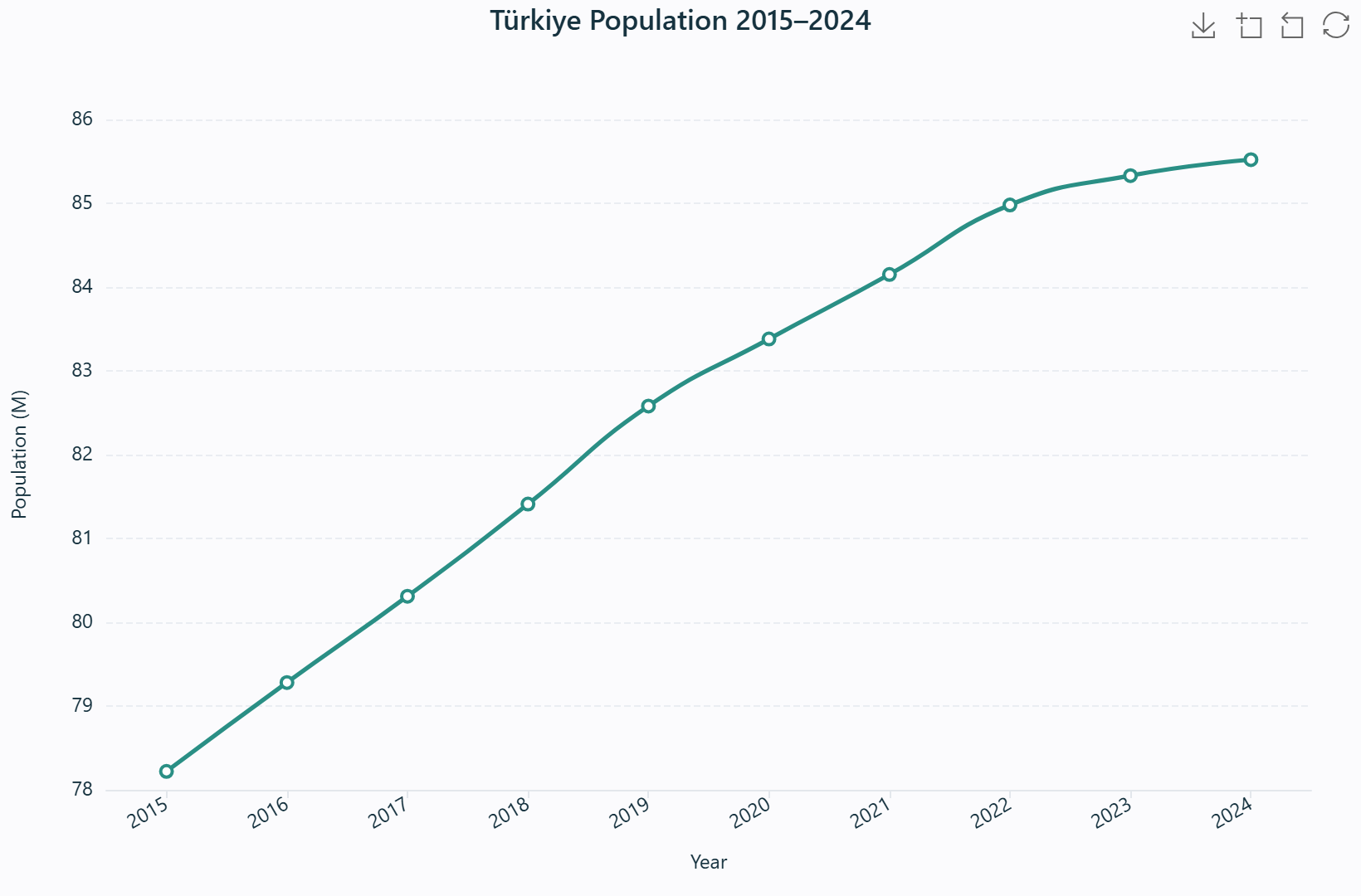
Türkiye population 2015–2024 — slope between points encodes the rate of change.
Real data. 78.22 million (2015) rising to 85.52 million (2024); annual growth slows from ~1.3% to ~0.2%.
Source: TÜİK / World Bank.
When to use
When the X axis is ordered — time, distance, phases — and you want to show change over that order. Pair with Animate by to unfold the trajectory over time, or with a Group field to overlay multiple series on one axis. Bars suit unordered categories; lines suit sequences.
What data you need
An ordered X field (year, distance, rank) and a numeric Y field. A Group field produces one polyline per category; an aggregation is applied per (X, group) pair.
How to read it
Follow the slope — a steep rise is fast growth, a steep fall is rapid decline, a flat run is stability. Peaks and troughs mark turning points. With multiple lines, compare their trajectories and where they cross.
Interpretation & applications
Identify growth or decline, inflection points, and diverging series. In planning: population, housing starts, or land consumption over a plan horizon — and, animated, the evolving trajectory of each district.
Field bindings & controls
| Binding | Role |
|---|
| X | Ordered category / numeric (time, sequence) |
| Y | Numeric |
| Group | One polyline per category (optional) |
| Aggregate / Top-N / Sort | Applied per (X, group) pair |
Engine support
ECharts ✓ · Plotly ✓ · Vega-Lite ✓ · Matplotlib ✓ — animatable; reference overlays available.
See also: Area for a filled variant ·
Animation for the play axis ·
Overlays to mark a target on the trend.
A line chart with the region under the curve filled. The fill adds a volume reading — useful for emphasising magnitude over time or, when stacked, the changing composition of a whole across categories.
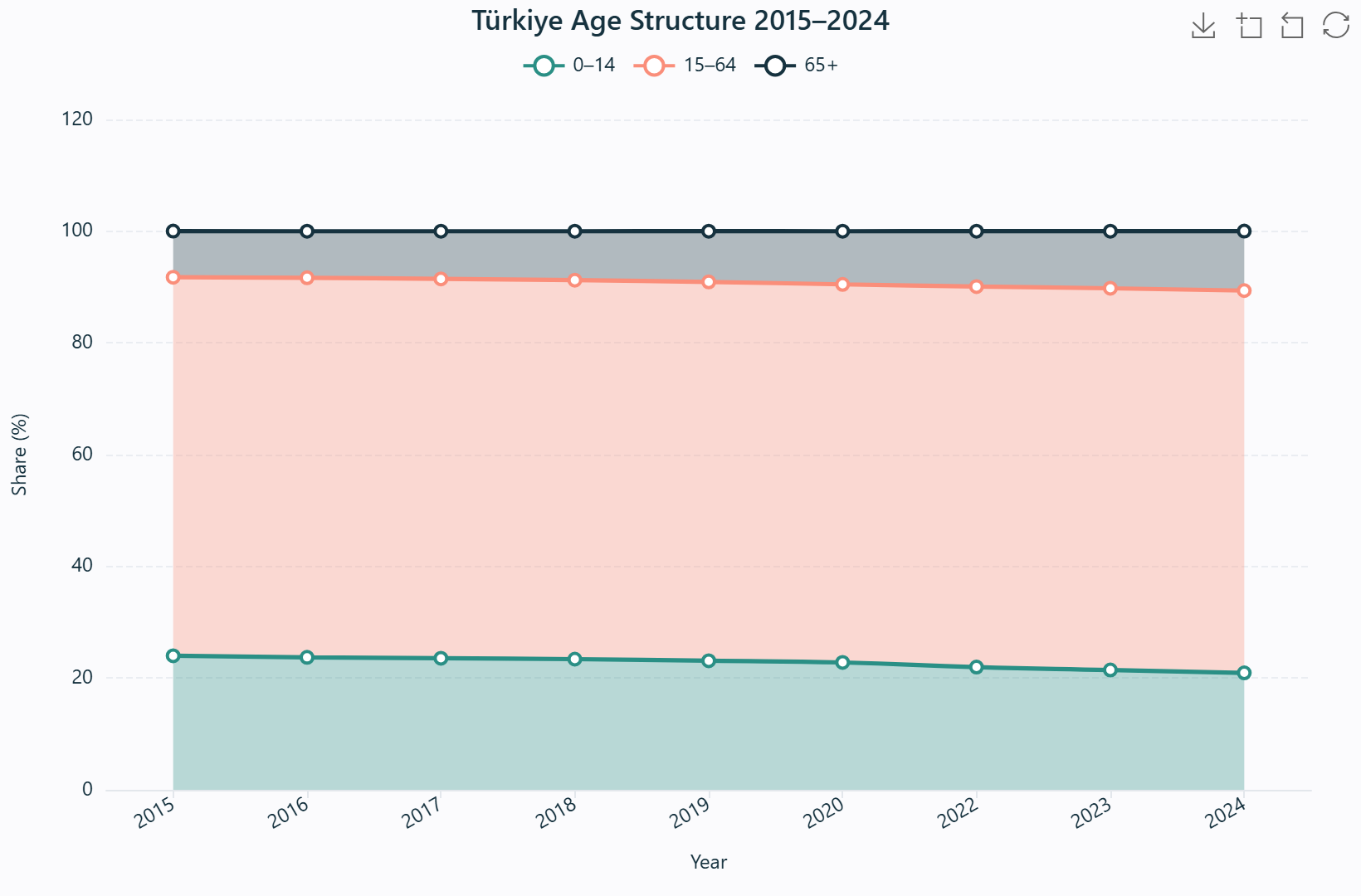
Türkiye age structure 2015–2024 (stacked) — band heights show how age groups shift.
Real data. The 0–14 share falls 23.99% → 20.93% while the 65+ share rises 8.25% → 10.64% — a visibly ageing population.
Source: TÜİK ADNKS.
When to use
Ordered X with a magnitude story. Stacked areas show how parts of a total evolve together (composition over time); unstacked areas compare magnitudes directly, overlapping where one exceeds another. The Stacked checkbox toggles between the two.
What data you need
An ordered X field, a numeric Y field, and (for the composition reading) a Group field that splits the total into coloured bands.
How to read it
In a stacked area the top edge is the total and each band's height is its share of that total; watch for bands widening or narrowing over time. In an unstacked area, compare the filled silhouettes' heights.
Interpretation & applications
Read structural shift: a band that grows while another shrinks is a reallocation. In planning: land-use or energy-mix change over a plan period, showing whether a city is densifying, sprawling, or greening.
Engine support
ECharts ✓ · Plotly ✓ · Vega-Lite ✓ · Matplotlib ✓ — animatable (composition over years); reference overlays available.
The fundamental bivariate display: two numeric fields plotted against each other, one point per feature. It exposes association, clusters, gaps, and outliers that summary statistics conceal. It is the first chart the Smart Assistant proposes when two numeric fields correlate.
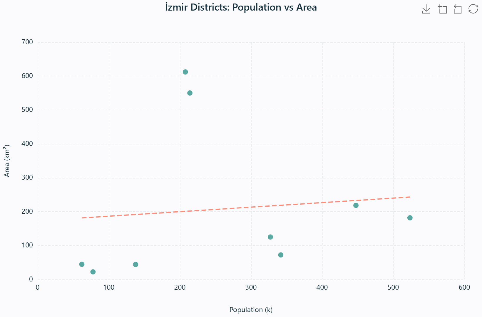
İzmir districts: population vs area, with a least-squares trend line.
Real data. Nine districts with both figures — e.g. Buca 523.5k / 181.9 km², Karşıyaka 341.9k / 72.3 km², Menemen 207.7k / 612.4 km².
Source: TÜİK ADNKS 2023; areas from İzmir-MOD.
When to use
When you have two numeric fields and want to know whether they are related — the first look at any suspected association. The optional trend line overlays a least-squares regression; Group colours points by category to expose structure within the cloud.
What data you need
Two numeric fields (X and Y), one point per feature. A Group field is optional for colouring; the trend checkbox adds the regression line.
How to read it
Read four properties: direction (upward = positive association, downward = negative), form (linear or curved), strength (tight cloud = strong, diffuse = weak), and outliers (isolated points far from the cloud).
Interpretation & applications
Ask whether X predicts Y and where the exceptions are. In planning: population vs density (sprawl check), income vs education, distance-to-transit vs property value. The trend line's slope and the Pearson \(r\) (available in the Explore dashboard) quantify the relationship.
Method — least-squares trend line
\(\beta = \dfrac{S_{xy}}{S_{xx}}, \quad \alpha = \bar{y} - \beta \bar{x}\)
where \(S_{xy} = \sum (x_i-\bar{x})(y_i-\bar{y})\) and \(S_{xx} = \sum (x_i-\bar{x})^2\).
Engine support
ECharts ✓ · Plotly ✓ · Vega-Lite ✓ · Matplotlib ✓ — animatable (Gapminder-style); reference overlays available.
A scatter plot with a third numeric dimension encoded as area. Because the eye reads area — not radius — a naive linear radius scaling systematically understates large values; 02viz therefore scales radii by square root so that perceived area is proportional to value.
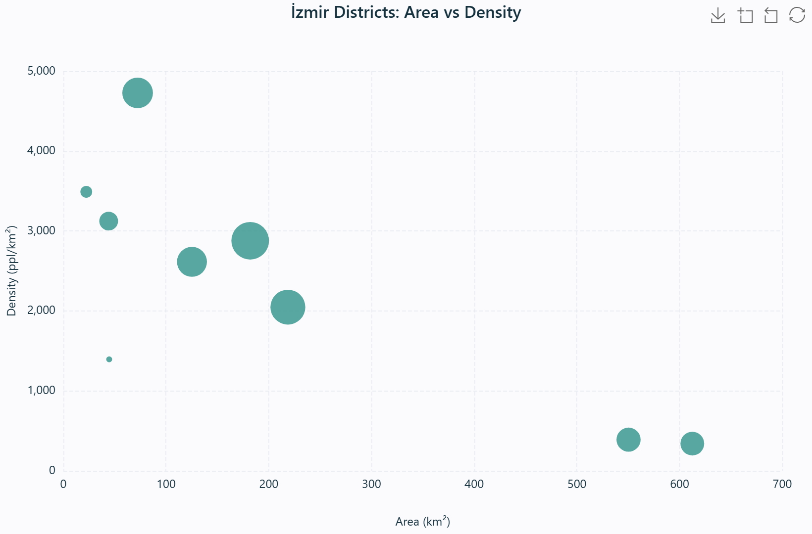
İzmir districts: area vs density — bubble size is population.
Real data. Karşıyaka 72.3 km² / 4,728 ppl/km² versus Menemen 612.4 km² / 339 ppl/km²; bubble area = population.
Source: TÜİK ADNKS 2023; areas from İzmir-MOD.
When to use
When you have three numeric fields: two for position and one for magnitude. It is the classic way to show which entities are both extreme on two measures and large on a third — and it animates into a Gapminder-style bubble race.
What data you need
Two numeric fields (X, Y) plus a numeric Value field for bubble area; Group is optional for colour.
How to read it
Compare bubble areas, never diameters — a bubble twice the diameter is four times the value. Look for the largest bubbles and where they sit on the two axes; during animation, a fixed value keeps a fixed size across frames.
Interpretation & applications
Identify the dominant entities and any trade-off between the three variables. In planning: GDP vs population with emissions as size, or district budget vs area with population as size.
Method — square-root radius scaling
\(r = r_{\min} + (r_{\max} - r_{\min}) \sqrt{\dfrac{v - v_{\min}}{v_{\max} - v_{\min}}}\)
Engine support
ECharts ✓ · Plotly ✓ · Vega-Lite ✓ · Matplotlib ✓ — animatable; reference overlays available.
The canonical display of a single numeric field's distribution: value on the X axis, frequency on the Y. It reveals centre, spread, skew, and modality at a glance, and is the natural first look at any unfamiliar numeric attribute.
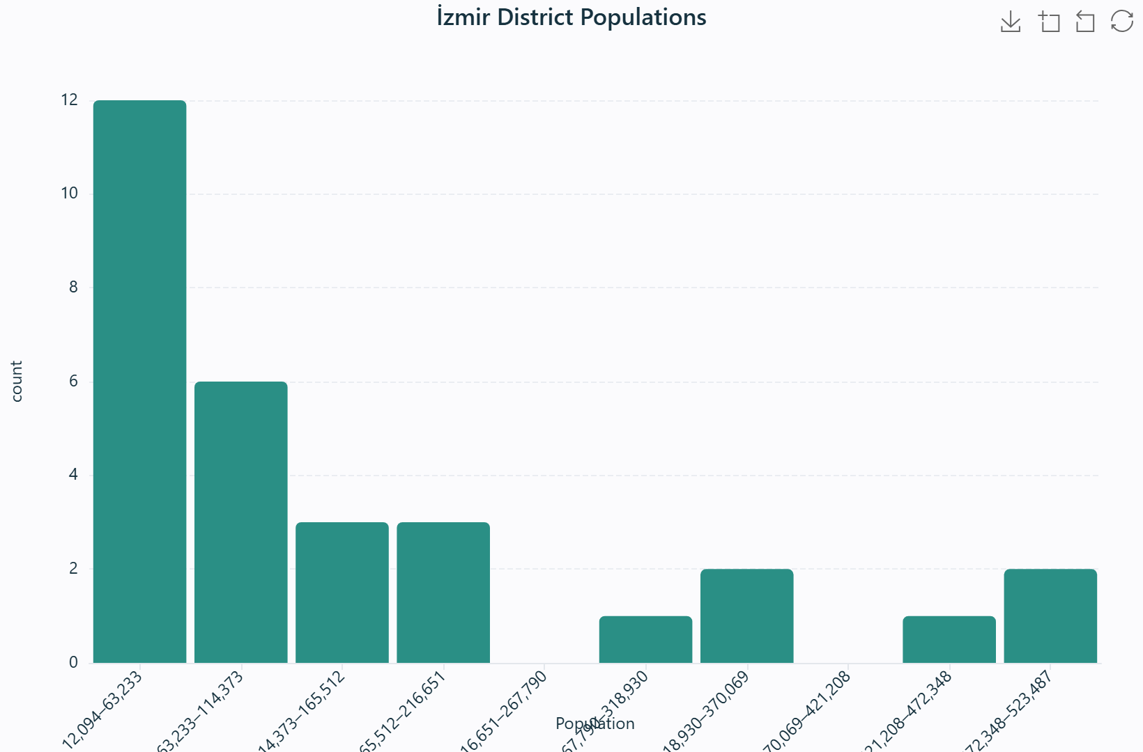
İzmir district populations — the shape of 30 districts' population distribution.
Real data. Thirty districts from Beydağ 12,094 up to Buca 523,487 — a heavily right-skewed distribution.
Source: TÜİK ADNKS 2023.
When to use
Whenever you meet an unfamiliar numeric field and want its distribution before anything else. It is also the honest pre-check for "is this roughly normal?" before methods that assume normality.
What data you need
A single numeric field. The Bins control sets the number of intervals — too few hide structure, too many reveal noise.
How to read it
Read four things: centre (where the peak is), spread (width of the mass), skew (a long tail to one side), and modality (one peak, two peaks = two sub-populations). Isolated bars at the edges are outliers.
Interpretation & applications
Classify the distribution as symmetric, skewed, or multimodal and decide accordingly. In planning: building heights (character of a skyline), income (inequality), plot sizes, or commute distances. A log transform is often suggested for a strong right skew — the Explore dashboard flags this automatically.
Method — equal-width binning
bin width \(w = \dfrac{x_{\max} - x_{\min}}{k}\), bin index \(i = \min\!\left(\lfloor \tfrac{v - x_{\min}}{w} \rfloor,\ k-1\right)\)
Engine support
ECharts ✓ · Plotly ✓ · Vega-Lite ✓ · Matplotlib ✓ — not animatable; no reference overlays.
A part-to-whole display using angle and area. In Cleveland & McGill's hierarchy, angle is a lower perceptual tier than position, so pies are recommended only for few categories where the question is "what share of the whole" rather than "which is larger by how much".
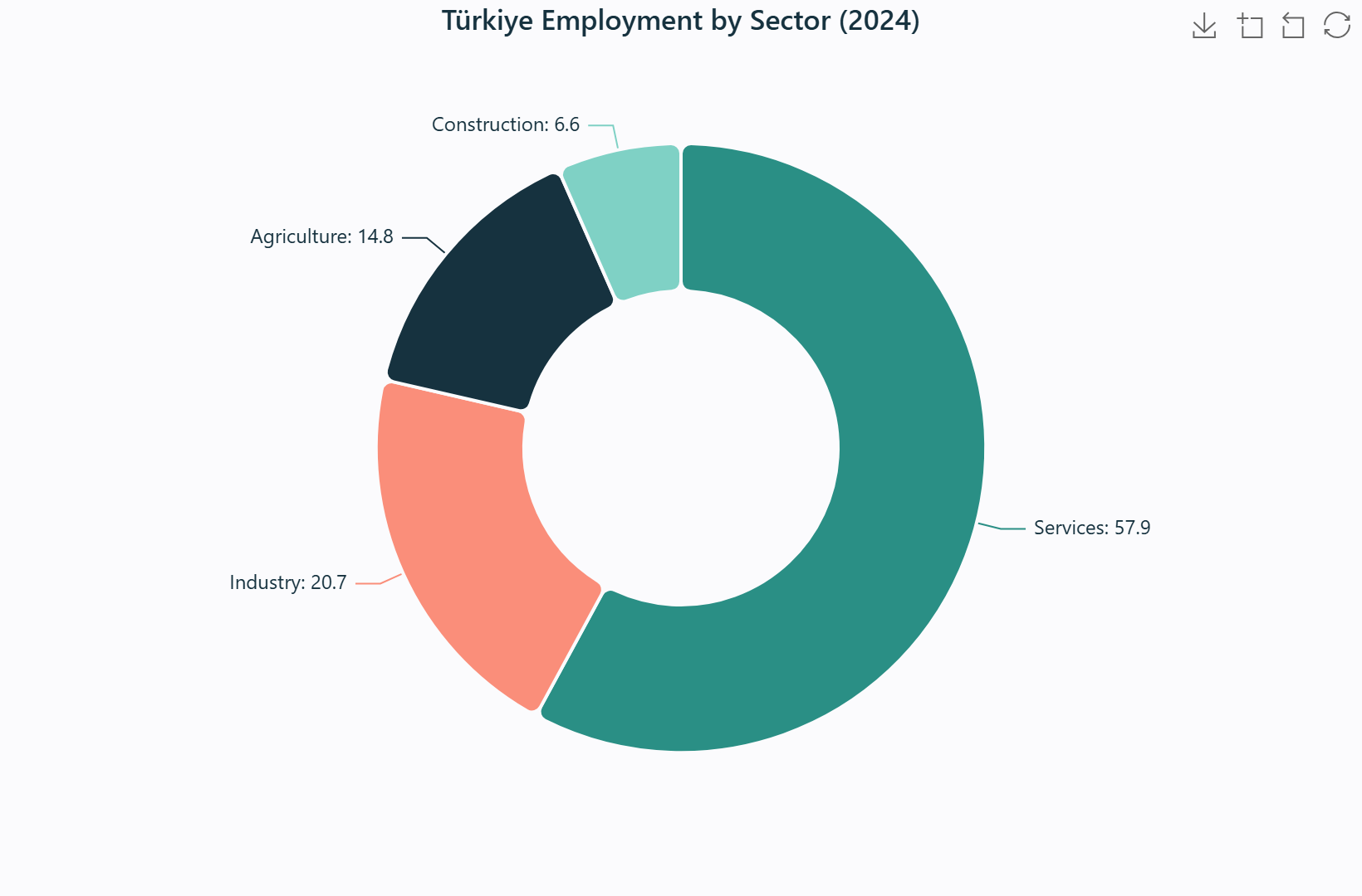
Türkiye employment by sector (2024) — angle encodes each sector's share.
When to use
A handful of categories summing to a meaningful whole (≤ 5–6). The donut variant opens the centre for a total label. The Top-N control collapses a long tail into "Other" so the pie stays readable.
What data you need
A categorical field and a numeric value (or a plain count). Each slice is one category's share of the total.
How to read it
Compare angles and areas — the largest slice is the dominant category. Don't ask a pie to answer "which is bigger by how much" for many similar slices; angles are hard to compare precisely.
Interpretation & applications
Show dominance and balance of a whole. In planning: land-use composition, budget allocation, or housing tenure mix. If you need exact magnitude comparison, switch to a bar chart.
Field bindings
| Binding | Role |
|---|
| Category | Categorical field |
| Value | Numeric — aggregated (count / sum / mean / …) |
Engine support
ECharts ✓ · Plotly ✓ · Vega-Lite ✓ · Matplotlib ✓ — animatable (composition over a play axis).
See also: Bar when magnitude comparison matters ·
Treemap /
Sunburst for nested part-to-whole.
A compact five-number summary — minimum, Q1, median, Q3, maximum — drawn as a box and whiskers. It compares centre and spread across groups and flags outliers without a single distributional assumption.
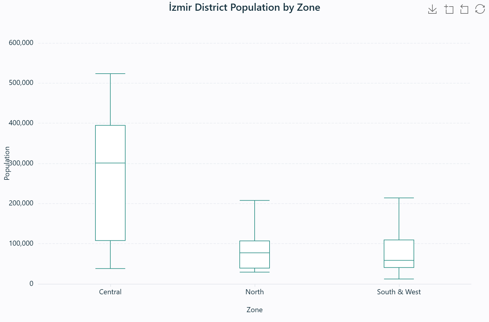
İzmir district population by zone — box = IQR, line = median, whiskers = range.
Real data. Central (11 districts) vs North (6) vs South & West (13); the Central zone has the highest and most variable district populations.
Source: TÜİK ADNKS 2023.
When to use
To compare the distribution — centre, spread, and outliers — of a numeric field across groups. A box plot is the compact alternative to side-by-side histograms when you have several groups.
What data you need
A numeric Y field, and optionally a category/group field to produce one box per category. Without a group, one box summarises the whole field.
How to read it
The box spans Q1–Q3 (the middle half of the data); the line is the median; the whiskers reach the range within the Tukey fences; dots are outliers. A taller box = more spread; a higher line = higher centre.
Interpretation & applications
Compare which groups have higher or lower centres, more or less variability, and where the outliers sit. In planning: house prices, rents, or income by district — the outliers often flag gentrified pockets or distressed areas worth a closer look.
Method — quantiles and Tukey fences
quantile \(= x_{[i]}(1-d) + x_{[i+1]}d\), outliers outside \([Q_1 - 1.5\,\mathrm{IQR},\ Q_3 + 1.5\,\mathrm{IQR}]\)
Engine support
ECharts ✓ · Plotly ✓ · Vega-Lite ✓ · Matplotlib ✓ — not animatable.
A colour-encoded matrix crossing two categorical fields: each cell's colour intensity encodes an aggregated numeric value. It compresses a two-way table into a single image, making dense patterns (correlation structure, origin–destination flows, category co-occurrence) immediately legible.
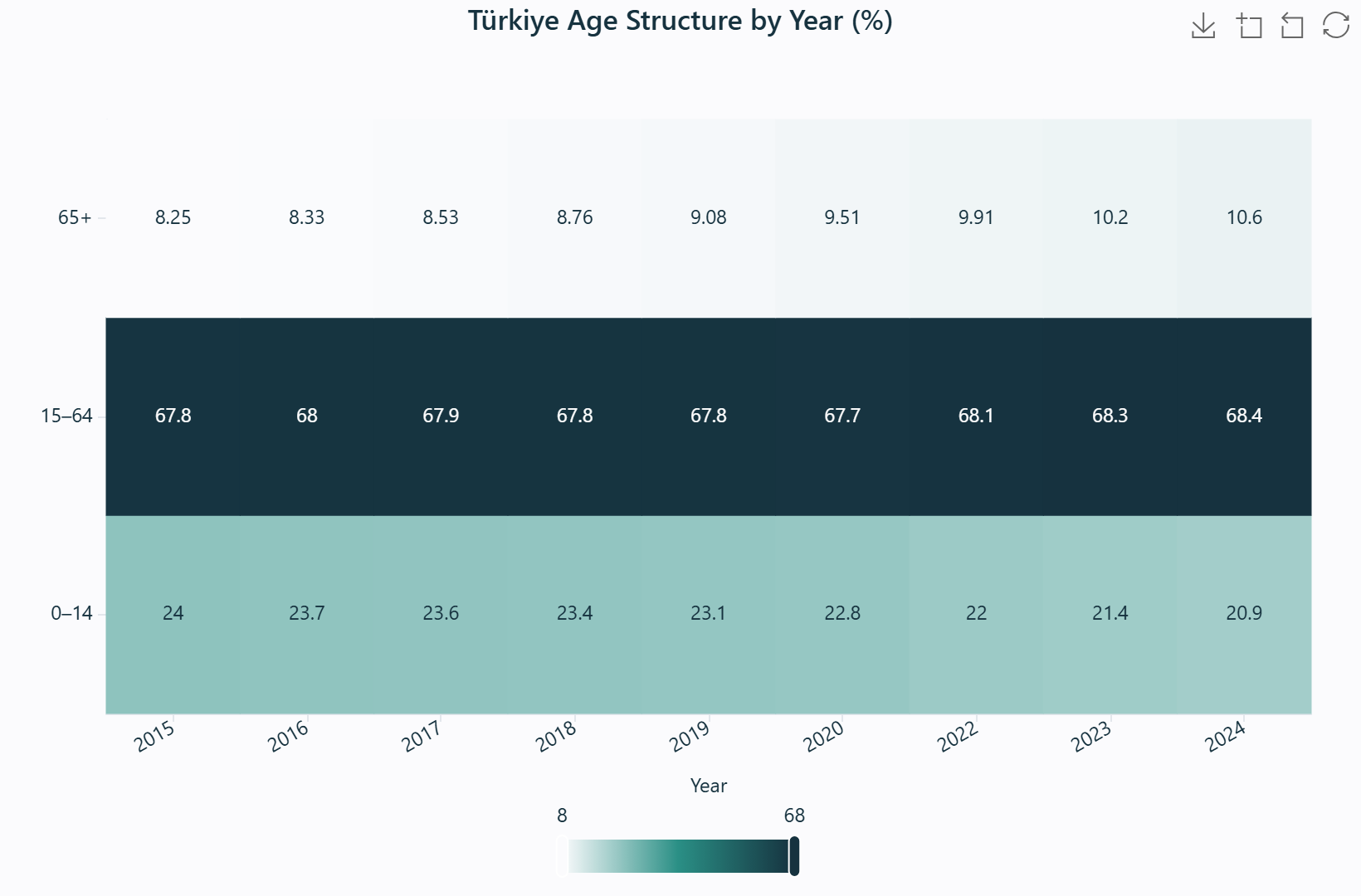
Türkiye age structure by year (%) — colour intensity encodes each share.
Real data. Nine years × three age groups; the 65+ row brightens from 8.25% (2015) to 10.64% (2024).
Source: TÜİK ADNKS.
When to use
When two categorical dimensions cross and you want to see the pattern in the resulting matrix — flows, co-occurrence, or a two-way table too large to read as numbers.
What data you need
Two categorical fields (X and Y) and a numeric Value field (or a plain count) aggregated per cell.
How to read it
Read colour intensity as magnitude. Scan for hot rows or columns (one category that dominates), a hot diagonal (self-interaction), and asymmetry (cell (i,j) differing from (j,i), a one-way flow).
Interpretation & applications
Find strong pairings and dominant directions. In planning: origin–destination commute or trip matrices, land-use transitions, or category co-occurrence. A hot diagonal means most flow stays within each zone; off-diagonal heat reveals the dominant corridor.
Field bindings
| Binding | Role |
|---|
| X | Categorical (rows) |
| Y | Categorical (columns) |
| Value | Numeric — cell value, aggregated |
Engine support
ECharts ✓ · Plotly ✓ · Vega-Lite ✓ · Matplotlib ✓ — not animatable.
A nested-rectangle display of a two-level hierarchy, where each rectangle's area is proportional to a value. It scales to far more categories than a pie chart while preserving part-to-whole reading, built by transform.tree_rows().
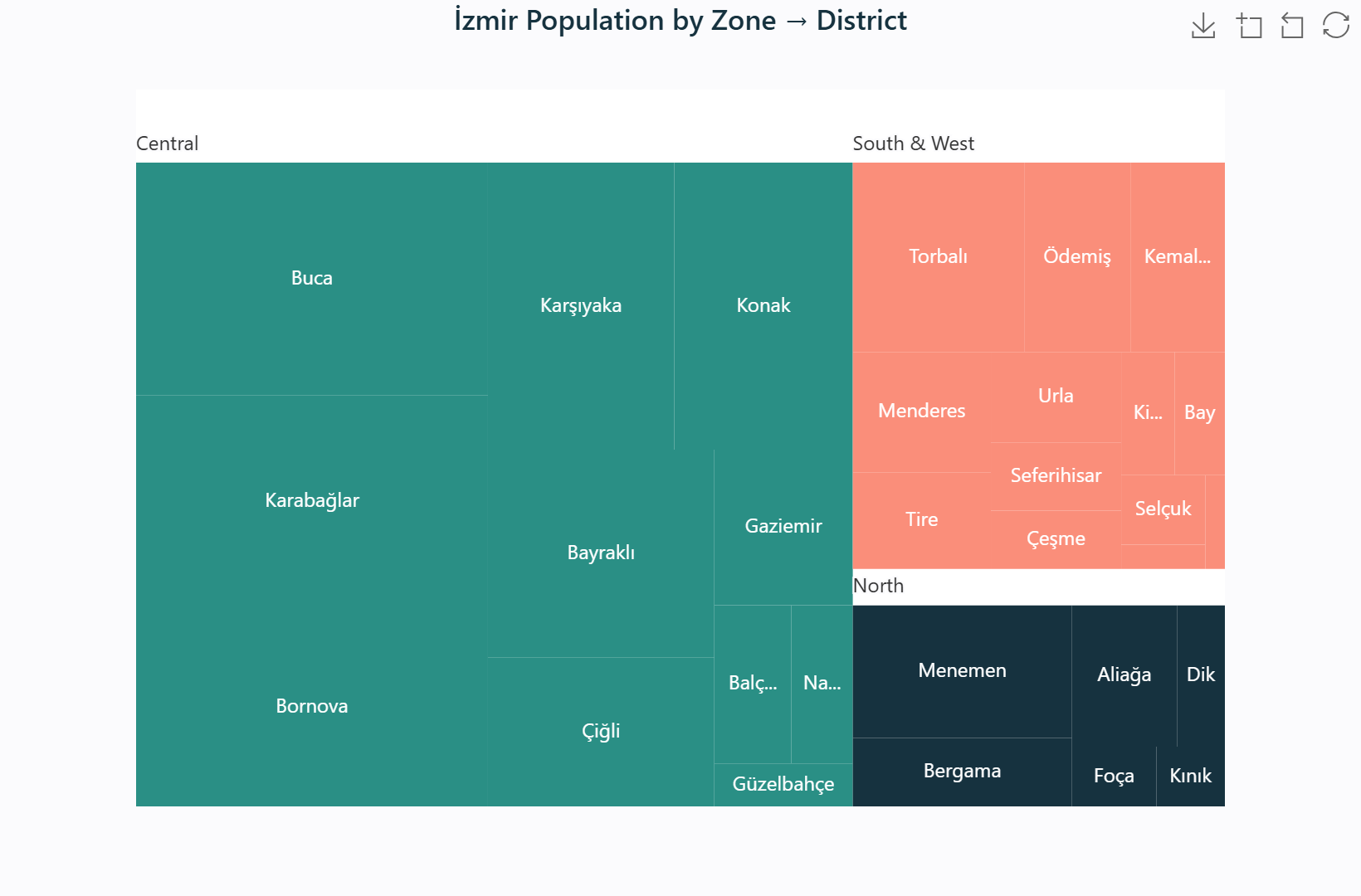
İzmir population by zone → district — rectangle area encodes population.
Real data. All 30 districts grouped into Central / North / South & West; the Central zone dominates the area.
Source: TÜİK ADNKS 2023.
When to use
When a two-level hierarchy has many categories and you want part-to-whole at both levels — outer rectangles are the top-level groups, inner rectangles their sub-division.
What data you need
Two grouping fields (outer + inner hierarchy) and a numeric Value field aggregated per group.
How to read it
Read area, not linear dimensions — the largest rectangle is the largest value. Outer rectangles group sub-values; compare areas within a group for the sub-composition and across groups for the top-level composition.
Interpretation & applications
Spot the dominant sector and its internal composition. In planning: employment by sector → subsector, budget by department → program, or land area by district → land-use class.
Field bindings
| Binding | Role |
|---|
| Group | Outer + inner hierarchy (two fields) |
| Value | Numeric — rectangle area, aggregated |
Engine support
ECharts ✓ · Plotly ✓ · Vega-Lite ✗ · Matplotlib ✗.
See also: Sunburst for the radial equivalent ·
Pie for flat part-to-whole.
The radial counterpart of a treemap: concentric rings encode hierarchy levels, with each segment's angular extent proportional to a value. It reads the same two-field structure as the treemap via transform.tree_rows() and shines for presentation of a shallow hierarchy.
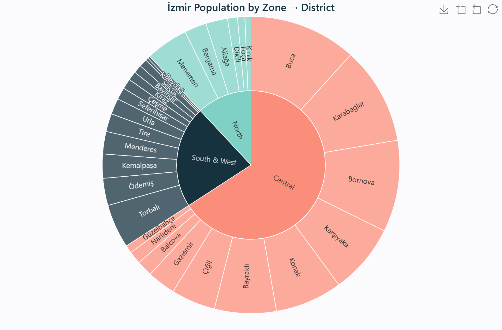
İzmir population by zone → district — rings are hierarchy levels, angle is population.
Real data. The same 30-district hierarchy, radially — Central dominates, then a long tail of smaller districts.
Source: TÜİK ADNKS 2023.
When to use
The same two-level hierarchy as a treemap, chosen for its visual impact in presentations and reports. Best for shallow hierarchies where rings stay readable.
What data you need
Two grouping fields (outer + inner) and a numeric Value field.
How to read it
Read from the centre outward: the inner ring is the top level, each outer ring the next level; a segment's angle is its share. Larger arcs = larger values.
Interpretation & applications
Communicate the structure of a whole at two levels. In planning: municipal budget by department → program, or energy consumption by sector → source.
Field bindings
| Binding | Role |
|---|
| Group | Outer + inner hierarchy (two fields) |
| Value | Numeric — segment angle, aggregated |
Engine support
ECharts ✓ · Plotly ✓ · Vega-Lite ✗ · Matplotlib ✗.
A per-category mean drawn with a shaded band one standard deviation either side. It communicates both central tendency and dispersion simultaneously — the honest alternative to a bare average that hides spread.
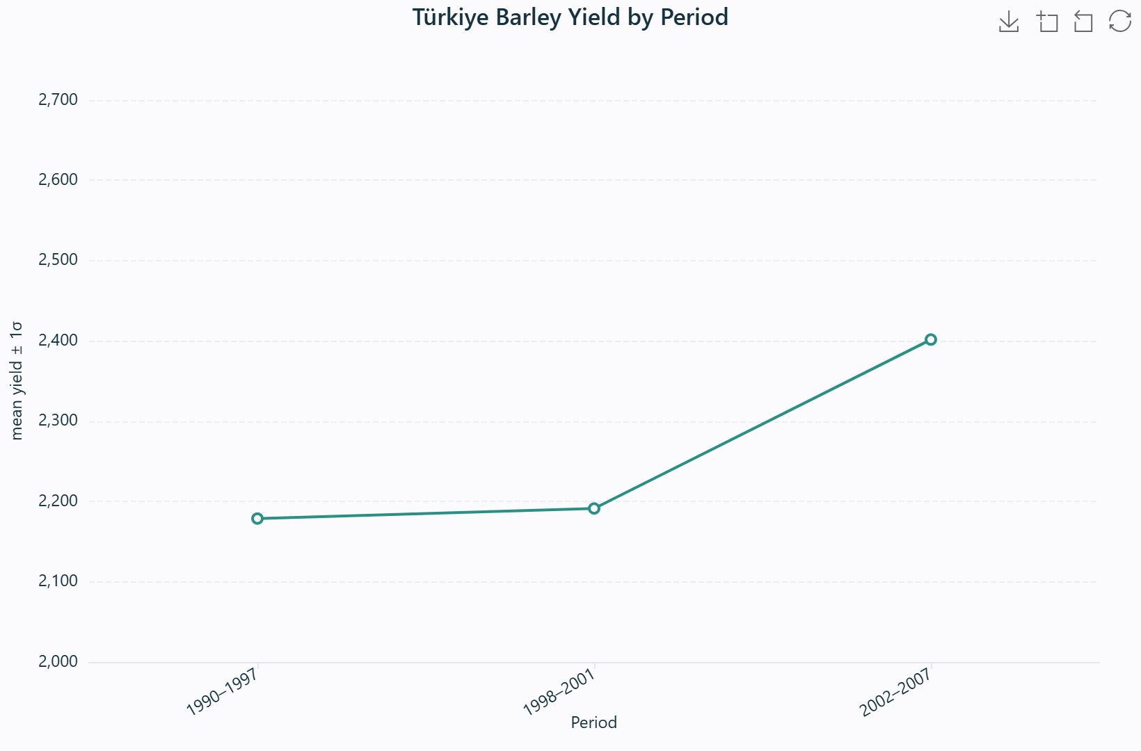
Türkiye barley yield by period — the bar is the mean, the shaded band is ±1σ.
Real data. 1990–1997 mean 2,179 kg/ha · 1998–2001 mean 2,191 · 2002–2007 mean 2,402 (with a wider band — the 2007 drought).
Source: TÜİK crop-production statistics.
When to use
When reporting a per-category average and its variability, so the reader sees both the typical value and how consistent it is. The band is ideal for a modest number of categories.
What data you need
A categorical X field and a numeric Y field; the mean and sample standard deviation are computed per category.
How to read it
The bar (or point) is the mean; the band spans one standard deviation. A wide band = high variability; overlapping bands suggest categories may not differ much, while non-overlapping ones suggest a real difference.
Interpretation & applications
Compare both level and reliability across categories. In planning: crop yield by type, air-quality readings by station, or service response times by district — a high mean with a huge band is a very different story from a high mean with a tight band.
Method
mean \(\bar{x} = \dfrac{1}{n}\sum x_i\), \(s = \sqrt{\dfrac{1}{n-1}\sum (x_i - \bar{x})^2}\), band \(= [\bar{x} - s,\ \bar{x} + s]\)
Engine support
ECharts ✓ · Plotly ✓ · Vega-Lite ✓ · Matplotlib ✗.
The whisker form of the mean-and-dispersion display: a point for each category's mean with an error bar spanning ±1σ. Cleaner than the band when many categories are compared, and the standard idiom for reporting group means with variability.
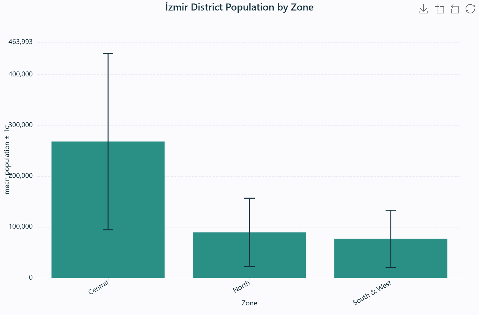
İzmir district population by zone — point is the mean, whisker is ±1σ.
Real data. Central mean ≈ 268,000 · North ≈ 89,000 · South & West ≈ 77,000.
Source: TÜİK ADNKS 2023.
When to use
The same mean-plus-variability story as the band, but for many categories where whiskers read more cleanly than filled bands.
What data you need
A categorical X field and a numeric Y field; mean and sample standard deviation are computed per category.
How to read it
Compare the points (means) and the whiskers (spread). A longer whisker = more variable; a higher point = higher average. Overlapping whiskers suggest little difference; well-separated ones suggest a real gap.
Interpretation & applications
Report group averages with honest uncertainty. In planning: monitoring-station readings, survey scores by neighbourhood, or infrastructure condition by zone.
Engine support
ECharts ✓ · Plotly ✓ · Vega-Lite ✓ · Matplotlib ✗.
Kernel density estimation smooths a histogram into a continuous probability-density curve, revealing modality and shape without the arbitrary choice of bin edges. The Gaussian kernel is used throughout.
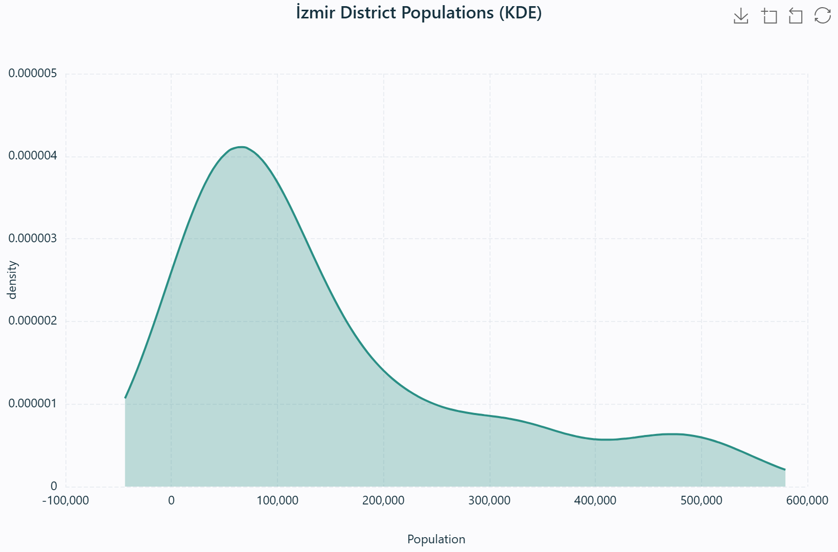
İzmir district populations (KDE) — a smoothed curve of the 30-district distribution.
Real data. Most districts cluster below ~150,000 with a long tail toward Buca's 523,487.
Source: TÜİK ADNKS 2023.
When to use
When you want the smooth shape of a numeric distribution rather than blocky bins — especially to detect multimodality (two or more peaks = sub-populations) that a histogram's bin choice can obscure.
What data you need
A single numeric field; an optional Group field overlays one curve per category.
How to read it
Read peaks as modes, the width of the curve as spread, and a long tail as skew. Two distinct peaks mean two underlying groups; a single tall peak means one dominant mode.
Interpretation & applications
Diagnose the distribution before modelling. In planning: income (bimodality reveals inequality or a divided market), travel times, or property values. With a Group, compare the shape of several districts at once.
Method — Silverman bandwidth + Gaussian KDE
\(\hat{h} = 0.9 \min(\hat{\sigma},\ \mathrm{IQR}/1.34)\ n^{-1/5}\)
\(\hat{f}(x) = \dfrac{1}{n\hat{h}\sqrt{2\pi}}\displaystyle\sum_{i=1}^{n}\exp\!\left(-\tfrac{1}{2}\left(\tfrac{x-x_i}{\hat{h}}\right)^{2}\right)\)
Engine support
ECharts ✓ · Plotly ✓ · Vega-Lite ✓ · Matplotlib ✓.
A KDE curve mirrored about a central axis, one "violin" per group, with the median marked. It fuses the box plot's quantile summary with the density curve's shape, exposing multimodality, skewness, and tail behaviour that a box hides.
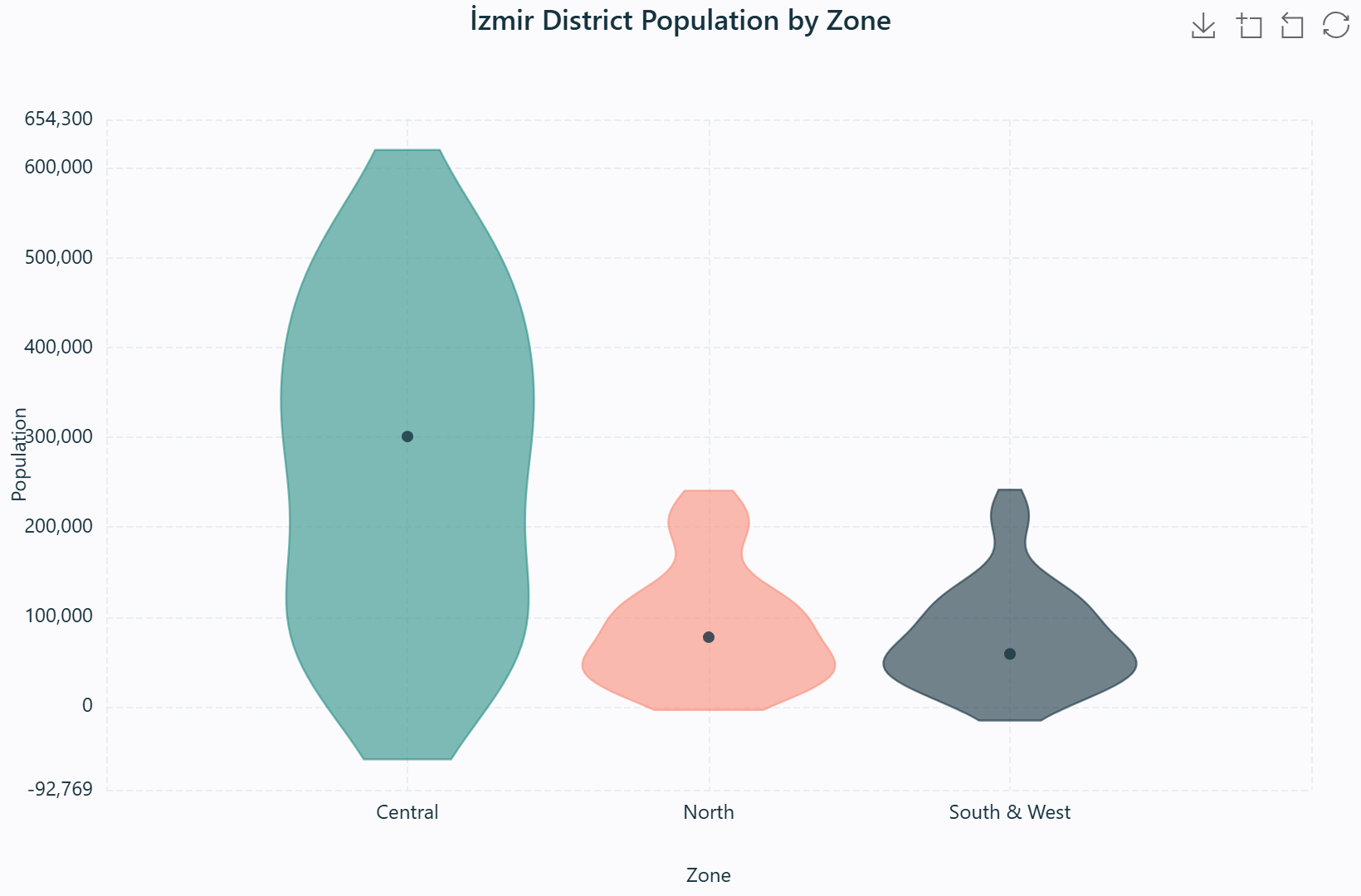
İzmir district population by zone — width is density, the white dot is the median.
Real data. Central (11) vs North (6) vs South & West (13); the Central violin is tallest and widest.
Source: TÜİK ADNKS 2023.
When to use
When a box plot's five numbers are not enough and you want the shape of each group's distribution — to catch bimodality or skewness a box would flatten away.
What data you need
A numeric Y field and an optional category/group field to produce one violin per group.
How to read it
Read width as frequency (wider = more data at that value), the white dot as the median, and the thin line as the inter-quartile range. A bulge near the top = many high values; two bulges = bimodal.
Interpretation & applications
Compare both shape and level across groups. In planning: test scores by school district (bimodality can flag a divided intake), commute times by zone, or environmental readings by site.
Method — mirrored density polygon
transform.violin_rows() computes a per-group density, then builds a closed polygon — the left half at [midpoint − half_width·d/peak, y], the right half mirrored. In ECharts this is drawn with a custom renderItem; in Vega-Lite a ranged-area workaround avoids the order channel so facets never collapse to zero width.
Engine support
ECharts ✓ · Plotly ✓ · Vega-Lite ✓ · Matplotlib ✓.
A multivariate profile drawn on N axes radiating from a centre, one spoke per numeric field. It compares several entities across many variables at once, revealing shape and trade-offs — invaluable for scoring, suitability, and indicator dashboards.
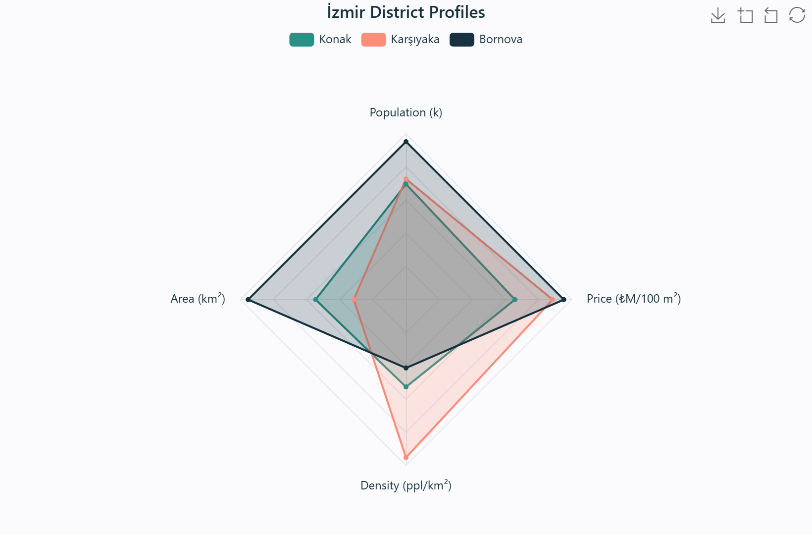
İzmir district profiles — each spoke is an indicator, each polygon a district.
Real data. Konak 327.3k / 125.2 km² / 2,614 ppl/km² / ₺2.9M · Karşıyaka 341.9k / 72.3 km² / 4,728 / ₺3.9M · Bornova 447.6k / 218.6 km² / 2,047 / ₺4.2M (per 100 m²).
Source: TÜİK ADNKS 2023; İzmir-MOD; Endeksa 2024.
When to use
To compare a few entities across several indicators at once — when the shape of a profile matters more than any single value. Ideal for scoring or suitability profiles where "balanced" versus "specialised" is the question.
What data you need
A category X field with at least three values (the axes) and a numeric Y field, plus an optional Group to draw one polygon per entity.
How to read it
Each spoke is one indicator (its own scale); a point far from the centre is high on that indicator. Compare polygon shapes — a large, balanced polygon is strong overall; a lopsided one is strong on some axes, weak on others.
Interpretation & applications
Expose strengths, weaknesses, and trade-offs per entity. In planning: district quality-of-life, site suitability, or service-coverage scoring — where the visual "footprint" of each alternative is the message.
Method — per-axis maxima
Axes are computed by transform.radar_axis_maxes(), padding each field's maximum by 5% so the top of a profile never touches the outer ring. Fields are normalised against their own maxima, so differently-scaled indicators compare fairly.
Engine support
ECharts ✓ · Plotly ✓ · Vega-Lite ✗ · Matplotlib ✗.
A bar chart of categories sorted descending, overlaid with a cumulative-share line. It operationalises Juran's (1954) principle — the vital few versus the trivial many — letting an analyst see instantly where the bulk of a total concentrates.
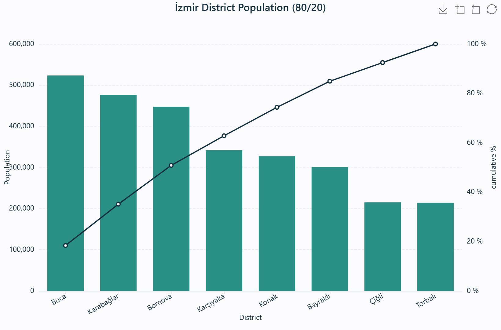
İzmir district population (80/20) — bars sorted descending, line is the cumulative share.
Real data. The eight largest districts hold 2,846,877 of İzmir's 4,479,525 people (63.6%).
Source: TÜİK ADNKS 2023.
When to use
When you need to rank causes, defects, or demands by impact and identify the few that account for most of the total — the classic prioritisation chart.
What data you need
A categorical X field and a numeric value (count or sum). Categories are sorted descending automatically.
How to read it
Bars descend from largest to smallest; the line climbs to 100%. The leftmost bars before the line reaches ~80% are the "vital few" that dominate the total; the long tail after is the "trivial many".
Interpretation & applications
Prioritise interventions on the few categories that matter most. In planning: the top complaint types, the leading causes of permit delays, or the dominant land-use conflicts — focus effort where the line crosses 80%.
Method — cumulative share
cumulative share \(s_i = \dfrac{\sum_{j \le i} v_j}{\sum v} \times 100\)
Engine support
ECharts ✓ · Plotly ✓ · Vega-Lite ✓ · Matplotlib ✗.
See also: Bar ·
Insights (which reports the top-category share automatically).
Map diagrams draw a small chart on every feature, using QGIS's native diagram renderer so the result is a real symbology that prints and exports like any other. Four types are available, all sized in millimetres and coloured with the active studio palette.
Types
| Type | QGIS class | Encodes |
|---|
| Pie | QgsPieDiagram | Composition of several numeric fields per feature |
| Bar | QgsHistogramDiagram | Side-by-side values of several fields |
| Stacked bar | QgsStackedBarDiagram (QGIS 3.14+) | Additive composition of fields |
| Text | QgsTextDiagram | Raw values as compact text |
Diagram size spans 3–60 mm (default 14 mm). Placement adapts to geometry type (AroundPoint / Line / OverPoint).
A pie or bar comparing fields on very different scales is dominated by the largest-magnitude field. Normalisation rescales each field before it is drawn, so every component contributes fairly. Statistics are computed from the features and baked into the diagram expressions — nothing is written back to the data.
Modes
| Mode | Expression | Use case |
|---|
| None | \(v\) | Same-scale fields (e.g. population components) |
| Min–max (0–1) | \(\dfrac{v - \min}{\max - \min}\) | Different ranges on one diagram |
| Z-score | \(\dfrac{v - \mu}{\sigma}\) | Statistical comparison; warns for pies (negative angles impossible) |
| Log | \(\ln(v - \min + 1)\) | Heavy-tailed distributions |
Watch the hint. The dock's _sync_diag_hint() warns for mathematically problematic choices — Z-score on a pie chart produces negative angles, and Log on values with zero or negative minima is undefined.
The Size by control scales each diagram between a small and a full-size one according to a chosen field, turning every feature into a proportional symbol. It is the classic thematic-map idiom — larger value, larger diagram — layered on top of any of the four diagram types.
Controls
| Control | Effect |
|---|
| Size by | Field | Scales diagram size between min and full size |
| Size (mm) | 3–60 mm | Full-size diagram; the small end is scaled proportionally |
| Avoid overlaps | Checkbox | Let QGIS displace diagrams to reduce collision |
Four curated label styles, each a named combination of halo, weight, and treatment, applied via native QgsPalLayerSettings and QgsVectorLayerSimpleLabeling — so labels behave, render, and export like any QGIS labeling.
Presets
| Preset | Treatment | Use |
|---|
| Clean | 0.6 mm white halo | Subtle, cartographic default |
| Strong halo | 1.2 mm halo | Labels survive busy basemaps |
| Bold | Heavy weight | Emphasis, no halo |
| Plain | No halo | Minimal, dense layouts |
Format a label without leaving the dock. Fields and formatting are combined into a single QGIS concat() expression, with a live preview showing the assembled expression and the first feature's evaluated value.
Formatting capabilities
| Control | Effect |
|---|
| Primary / Second field | Two fields; second row joined with char(10) |
| Decimals | −1 to 6 via round() |
| Thousands separator | format_number() |
| Prefix / Suffix | Wrapped with concat() |
| Case | upper / lower / title |
| Word wrap | wordwrap() with configurable limit |
| Advanced expression | Freeform QGIS expression overrides all formatting; validated |
Number safety. Numeric fields receive rounding and number formatting; text fields never do — 02viz never applies a numeric function to a string and corrupts the label.
See also: Presets ·
Smart Assistant (which proposes a two-line label when name + measurement fields both exist).
The Explore layer button profiles every field of a layer and renders a complete interactive dashboard in one operation — an automated exploratory data analysis (Tukey, 1977) with toggleable tiles.
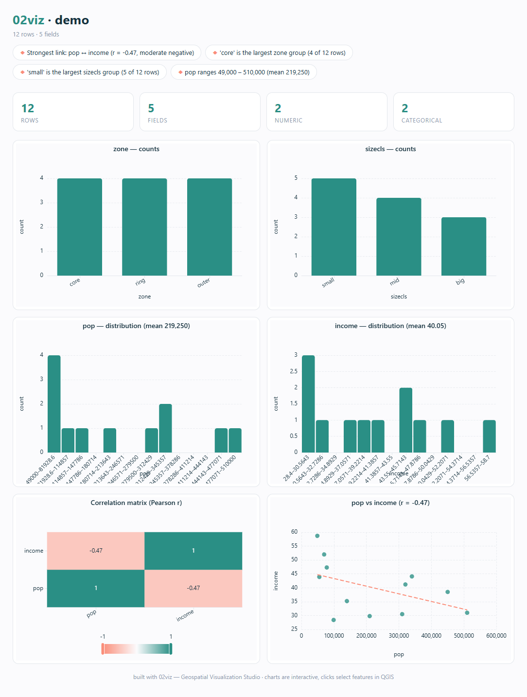
The one-click Explore dashboard: KPI cards, field summaries, auto charts, correlation matrix, and a trend scatter.
Tiles
| Tile | Contents |
|---|
| KPI cards | Row count, field counts (total / numeric / categorical), cell completeness % |
| Field summary | Per-field type badge, missing % (green <5%, amber 5–20%, red >20%), distinct count, range / top category |
| Categorical bars | Up to 4 fields, Top-N control |
| Histograms | Up to 6 numeric fields, 14 bins each |
| Normalised box plot | All numeric fields on one 0–1 axis (min–max normalised) for cross-scale comparison |
| Correlation matrix | Pairwise Pearson \(r\), diverging colour (blue-negative / red-positive), labelled cells, up to 8 fields |
| Scatter + trend | Strongest \(|r|\) field pair, sampled to 3,000 points, with trend line |
| Insights | Plain-English chips — dominant category, range, skew with log hint, outliers, near-constant and mostly-empty fields, notable correlations |
Identifier columns (fid/id/gid/uuid) are skipped automatically.
Pick a time or sequence field and any of six chart types plays through it — bar-chart race, Gapminder bubbles, or composition unfolding over the years — with axes and colours held steady so values animate in place. This axis stability follows Tufte's (1983) principle of holding the frame of reference constant.
The five-stage pipeline
frame_groups() partitions rows by the animate field, ordered numerically or lexicographically.union_categories() merges all frames' categories into a stable axis order.align_values() pads missing categories with zeros.- Global numeric ranges are fixed across frames so axes never rescale.
- Bubble radii are globally scaled once so the same value maps to the same size across frames.
Playback & scope
| Control | Values |
|---|
| Speed | Slow (1600 ms/frame) · Medium (900) · Fast (450) |
| ECharts | timeline with autoPlay + loop |
| Plotly | frames + slider + play/pause |
| Eligible | bar · line · area · scatter · bubble · pie |
Reference overlays are hidden during animation. Animated bars and points still click to select features on the map, and the animation exports in the one-file HTML.
Drop statistical reference lines and bands onto bar, line, area, scatter, and bubble charts: the mean, the median, a target value you type, a ±1σ band, and the inter-quartile (Q1–Q3) band. Computed in pure Python from the plotted values and drawn identically by all four engines, so they read the same in light and dark and export with the chart.
Overlays
| Overlay | Computation | Style |
|---|
| Mean | \(\bar{x} = \frac{1}{n}\sum x_i\) | Dashed line + label |
| Median | Linear-interpolation median | Dotted line + label |
| ±1σ band | \([\bar{x} - s,\ \bar{x} + s]\) | Shaded region |
| IQR band | Shaded Q1 → Q3 | Shaded region + label |
| Target | User-entered constant | Solid emphasis line |
Engine rendering
ECharts markLine/markArea · Plotly layout.shapes · Vega-Lite rule/rect layers · matplotlib axhline/axhspan. Hidden during animation.
The Suggest a chart button reads the active layer's fields and configures the most insightful chart for you — telling you why. It is a pure-Python, zero-network recommendation engine: no account, no internet, no new dependencies.
Recommendation heuristics
| Field signature | Recommendation |
|---|
| Two numeric, \(|r| \ge 0.4\) | Scatter + trend line |
| Categorical + numeric | Mean bar |
| Categorical only | Count bar |
| Numeric only | Histogram |
suggestions() also evaluates the other tabs: diagram normalisation (min–max / log when a field-range ratio ≥ 50×) and label configuration (two-line when name + measurement fields are both present).
Save a named chart setup and reuse it across QGIS sessions — and across layers. A preset records engine, chart type, field bindings, aggregation, bins, Top-N, sort, stacked/trend flags, overlays, theme, palette, and animation speed. On load, fields remap by name; unavailable fields are cleared and reported.
What a preset stores
Engine · chart type · field bindings (by name) · aggregation · bins · Top-N · sort · stacked / trend flags · reference overlays · theme · palette · animation speed. Stored as JSON (schema v1) in QSettings.
Charts and the map stay linked in both directions. Click a bar, slice, or point and the matching features are selected on the canvas; select features on the canvas and the chart instantly dims everything else — no re-render.
How the bridge works
Chart pages encode clicked feature IDs as document.title = "o2viz-select:<id,id,…>:<seq>" via __o2vizSelect(); the dock's titleChanged listener forwards to SelectionBridge, which calls layer.selectByIds(ids). Reverse cross-filter pushes __o2vizHighlight(ids) to dim non-selected items to opacity 0.16. Selection lists over 20,000 IDs skip highlighting for performance.
Why title transport. addToJavaScriptWindowObject crashes inside WebCore on Qt 5.15's QtWebKit fork, and QWebChannel exists only on WebEngine. The page title is the one signal safe and identical on both stacks — in a plain browser it is a harmless blip.
Four themes and eight palettes give every chart a consistent typographic and colour voice; an inline swatch editor recolours any palette, and the override propagates identically across ECharts, Plotly, and Vega-Lite.
Themes
| Theme | Background | Use |
|---|
| Studio Light | #fbfbfd | Default |
| Ink Dark | #131c21 | Presentations |
| Soft Pastel | #ffffff | Muted, light content |
| Bold Print | #ffffff | Publication-ready monochrome |
Palettes
Vivid (high-chroma) · Colorblind safe (8-colour, Wong 2011 guidance) · Viridis (perceptually uniform sequential) · Sunset (warm orange→purple) · Ocean (cool teal→navy) · Earth (beige→forest) · Berry (red-violet) · Grayscale print (distinct lightness steps).
Custom swatches
Inline swatches right in the dock — click one to recolour it via QColorDialog, +/− to resize the palette (up to 16 colours). Auto-switches to "Custom…" mode.
Every statistic and data-shaping operation is pure Python — no pandas, no numpy. The result is a studio that runs identically offline, in tests, and inside QGIS.
Methods
- Aggregation — count, sum, mean, median (linear interpolation), min, max.
- Pearson correlation — \(r = \frac{\sum(x_i-\bar{x})(y_i-\bar{y})}{\sqrt{\sum(x_i-\bar{x})^2}\sqrt{\sum(y_i-\bar{y})^2}}\), with zero-variance degeneracy checks.
- Skewness — adjusted Fisher–Pearson \(g_1 = \frac{\sqrt{n(n-1)}}{n-2}\cdot\frac{m_3}{m_2^{3/2}}\); a log-transform hint fires when \(|g_1| \ge 0.5\).
- Outliers — Tukey inner fences \([Q_1 - 1.5\,\mathrm{IQR},\ Q_3 + 1.5\,\mathrm{IQR}]\).
- KDE — Silverman bandwidth, Gaussian kernel.
- Box plots — linear-interpolation quantiles.
- Field classification — numeric (≥60% numeric, >8 distinct), categorical (≤30 distinct), identifier (skip).
- Data shaping — group-by, pivot, Top-N with "Other" collapse, per-frame slicing, bubble sqrt-scaling, trend line, treemap/sunburst hierarchies.
Methodological Notes
Design decisions worth recording — the "why" behind the plugin's behaviour, drawn from the visualisation and cartography literature.
Position over angle. Cleveland & McGill (1984) rank position along a common scale as the most accurately perceived encoding and angle as one of the least. 02viz defaults to bar charts for magnitude comparison and reserves pie/angle encoding for few-category part-to-whole questions.
Area, not radius. The eye perceives bubble area, so radius is scaled by square root (\(\sqrt{v}\)) to keep perceived size proportional to value. The same principle governs map-diagram "Size by", which scales diagram area rather than linear extent.
Hold the frame of reference. Following Tufte (1983), animation fixes axes, category order, colours, and bubble scaling across frames so movement reads as data change rather than axis rescaling. Reference overlays are hidden during animation for the same reason.
Normalisation is not data edit. Diagram normalisation (min–max / Z-score / log) is baked into the diagram expression from feature statistics; it never writes new columns, so the source layer is untouched. Z-score on a pie chart produces negative angles — the dock warns rather than silently rendering nonsense.
Pure Python by construction. Aggregation, correlation, skewness, KDE, quantiles, and outlier detection are implemented directly rather than delegated to pandas/numpy, keeping the core studio dependency-free and its behaviour verifiable in plain unit tests.
Academic References
- Wilkinson, L. (2005). The Grammar of Graphics (2nd ed.). Springer. DOI: 10.1007/0-387-28695-0
- Tufte, E. R. (1983). The Visual Display of Quantitative Information. Graphics Press.
- Tukey, J. W. (1977). Exploratory Data Analysis. Addison-Wesley.
- Cleveland, W. S. & McGill, R. (1984). Graphical perception: Theory, experimentation, and application to the development of graphical methods. Journal of the American Statistical Association, 79(387), 531–554. DOI: 10.1080/01621459.1984.10478080
- Satyanarayan, A., Moritz, D., Wongsuphasawat, K., & Heer, J. (2017). Vega-Lite: A grammar of interactive graphics. IEEE Transactions on Visualization and Computer Graphics, 23(1), 341–350. DOI: 10.1109/TVCG.2016.2599030
- Hunter, J. D. (2007). Matplotlib: A 2D graphics environment. Computing in Science & Engineering, 9(3), 90–95. DOI: 10.1109/MCSE.2007.55
- Li, D., Mei, H., Shen, Y., Su, S., Zhang, W., Wang, J., Zu, M., & Chen, W. (2018). ECharts: A declarative framework for rapid construction of web-based visualization. Visual Informatics, 2(2), 136–146. DOI: 10.1016/j.visinf.2018.04.011
- Silverman, B. W. (1986). Density Estimation for Statistics and Data Analysis. Chapman & Hall. DOI: 10.1007/978-1-4899-3324-9
- Wong, B. (2011). Points of view: Color blindness. Nature Methods, 8(6), 441. DOI: 10.1038/nmeth.1618
- Juran, J. M. (1954). Universals in management planning and controlling. Management Review, 43(11), 748–761.